
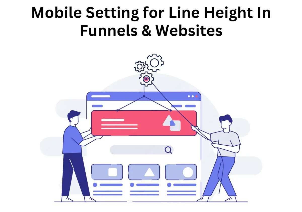
Mobile Setting for Line Height in Funnels & Websites: A Complete Guide
Ever noticed how text that looks perfect on a desktop suddenly feels cramped or awkwardly spaced in the mobile version? It's like the letter spacing, content fonts, and the whole visual appeal completely transformed. That’s because line height plays a huge role in readability and user experience, especially on smaller screens. If your content is too tight, it becomes hard to read; if it’s too loose, it disrupts the flow.
With Zapiy's latest update, you no longer have to settle for a one-size-fits-all approach. You can now customize line height separately for desktop and mobile views, ensuring your funnels and websites look polished and professional on any device.
Mobile Setting for Line Height in Funnels & Websites: A Complete Guide
Why Mobile-Responsive Line Height Matters
How Mobile-Responsive Line Height Helps
Best Practices for Setting Line Height on Mobile
Use Relative Units Instead of Fixed Values
Follow Recommended Line Height Ratios
Adjust for Different Font Styles
Optimize for Different Mobile Screen Sizes
Ensure Proper Spacing in Buttons & CTAs
Avoid Common Line Height Mistakes
How to Adjust Line Height in Funnel & Website Builders
Testing & Refining Mobile Line Height
Why Testing Line Height on Mobile is Essential
Common Line Height Mistakes & How to Fix Them
Why Mobile-Responsive Line Height Matters
Before this update, setting the right line height for different screen sizes was a challenge. Many funnel builders and website designers had to rely on universal line height settings, which meant that spacing that looked great on desktop often felt too tight or too loose on mobile. This lack of flexibility led to inconsistent typography, poor readability, and a frustrating user experience—especially on smaller screens where text needs to be carefully formatted for clarity.
To overcome these limitations, designers often turned to manual adjustments, CSS coding, or complicated workarounds. While these methods worked, they required extra effort and technical knowledge, making the design process more time-consuming and less efficient.
How Mobile-Responsive Line Height Helps
With this latest update, you now have the ability to adjust line height separately for desktop and mobile views, ensuring a more refined and responsive design. Here’s how this enhancement benefits your funnel-building process:
✅ Enhanced Readability – Proper spacing makes your text easier to read, reducing strain on the eyes and improving the overall user experience. Mobile users won’t have to zoom in or struggle with cramped text.
✅ Consistent Design – You no longer have to compromise between desktop and mobile aesthetics. Adjusting line height separately ensures that your content looks professional and balanced on all devices.
✅ Increased Engagement – Well-structured content encourages users to stay longer on your page, leading to better interaction, lower bounce rates, and higher conversions. When text is easy to digest, visitors are more likely to take action.
A Seamless Design Experience
This update simplifies mobile formatting at the element level, allowing you to fine-tune typography without extra coding. Whether you’re building a landing page, sales funnel, or a complete website, this feature helps create a clean, professional, and visually appealing layout across all devices.
Best Practices for Setting Line Height on Mobile
Setting the right line height for mobile content is crucial for readability, accessibility, and user engagement. Mobile screens are smaller, requiring careful attention to spacing. If the line height is too tight, text becomes difficult to read; if too loose, users must scroll excessively.
Use Relative Units Instead of Fixed Values
Avoid using fixed pixel (px) values, as they do not scale dynamically across different screen sizes. Instead, use relative units such as:
em (relative to the element’s font size)
rem (relative to the root font size)
Percentage (e.g., 150%)
Why relative units work better:
Adapt automatically to different screen sizes
Scale proportionally with text size adjustments
Ensure consistency in responsive designs
Example CSS:

Follow Recommended Line Height Ratios
A well-balanced line height improves readability. General guidelines:
Body text: 1.4 to 1.6 times the font size
Headings: 1.2 to 1.4 times the font size
Captions & small text: 1.3 to 1.5 times the font size
Recommended Line Heights by Font Size:

Adjust for Different Font Styles
Different font families require different line heights:
Serif fonts (Times New Roman, Georgia): 1.5 to 1.7
Sans-serif fonts (Arial, Roboto, Open Sans): 1.4 to 1.6
Script & Decorative fonts: 1.7 to 2.0
Test different font styles with adjusted line heights for optimal readability on mobile screens.
Optimize for Different Mobile Screen Sizes
Responsive typography ensures optimal readability across devices. A line height that works on a 6.7-inch device may be too tight on a 5.4-inch screen.
Optimization Techniques:
Use CSS media queries to adjust line height based on screen width
Increase line height for smaller screens to improve readability
Test spacing on multiple devices
Example CSS:

Ensure Proper Spacing in Buttons & CTAs
If text inside buttons is too cramped, readability suffers.
Best Practices:
Use 1.2 to 1.4 line height for button text
Ensure balanced padding and spacing
Test CTA readability across devices
Example CSS:

Test & Refine Line Height
Regular testing ensures an optimal reading experience.
Useful Tools:
Google Lighthouse: Analyzes legibility and accessibility
Browser DevTools: Adjust CSS in real time
Screenfly: Tests mobile views on different devices
A/B Testing: Experiments with different line heights
Avoid Common Line Height Mistakes
Using the Same Line Height for All Text
Different text types need different spacing.
Setting Line Height Too Low
Makes text feel cramped; always test readability.
Overusing Large Line Heights
Creates excessive white space; follow recommended values.
Ignoring Dark Mode Adjustments
Dark mode requires slightly higher line height for readability.
Example CSS:

By following these best practices, you can ensure that mobile content remains readable, accessible, and engaging.
How to Adjust Line Height in Funnel & Website Builders
Optimizing line height for mobile devices has never been easier! With the latest update, you can customize line height settings for individual elements, ensuring a seamless and visually appealing experience across all screen sizes. Here’s how to do it:
1️⃣ Open the Sites Tab – Navigate to the left-side menu and select the Funnels tab. Click on "+New Funnel" to start a new project.

2️⃣ Choose a Starting Point – You can either build from scratch or select a template to get started quickly.

3️⃣ Enter the Funnel Builder – Click the edit button to access the funnel editor.

4️⃣ Add a Section – Click the “+” button to insert a new section into your funnel layout.

5️⃣ Set Up the Structure – Add a row with the desired number of columns.

6️⃣ Insert Elements – Drag and drop text, images, buttons, or other elements from the available list.

7️⃣ Go to Advanced Settings – Once an element is placed, open its settings and navigate to the Advanced tab.

8️⃣ Find the Line Height Feature – You'll see the new line height adjustment option for every element.

9️⃣ Switch to Mobile View – Toggle the mobile preview to customize the spacing specifically for smaller screens.

🔟 Fine-Tune the Line Height – Adjust the spacing to improve readability and create a more polished mobile design.

Testing & Refining Mobile Line Height
Once you’ve adjusted the line height on your mobile website or funnel, the next crucial step is testing and refining. Proper testing ensures that your text remains readable, visually appealing, and accessible across all screen sizes and devices. Without testing, you may end up with text that appears too cramped or too spread out, which can negatively impact user engagement and conversions.
Refining line height isn’t a one-time task—it requires continuous adjustments based on user feedback, analytics, and A/B testing. In this guide, we’ll cover:
The importance of testing line height for mobile screens
Methods for testing line height effectiveness
Tools to analyze readability and user experience
How to refine and optimize line height based on test results
Common mistakes to avoid in the refinement process
Why Testing Line Height on Mobile is Essential
Even if your website or funnel looks great on desktop, it may not translate well to mobile. Since mobile screens are smaller and text elements are often resized automatically, line height adjustments must be tested thoroughly to prevent formatting issues.
Here’s why testing is necessary:
Ensures readability – Verifies that text remains legible across different devices.
Prevents content overlap – Avoids cases where text lines are too close together, making reading difficult.
Maintains design consistency – Ensures that line height complements other design elements like image icon, image gallery and buttons.
Optimizes for user engagement – Well-spaced text reduces fatigue and improves readability, increasing conversions.
Common Line Height Mistakes & How to Fix Them
Setting the right line height is essential for readability and user experience, yet many overlook key mistakes that impact engagement and conversions. Here’s how to avoid them:
1. Using Desktop Line Height on Mobile
Issue: Default desktop settings often appear too cramped or wide on mobile.
Fix: Use mobile-specific values (1.4–1.6) and adjust using CSS media queries.
2. Setting Line Height Too Tight
Issue: Crowded text strains the eyes and makes navigation harder.
Fix: Keep body text at 1.4+ and headings at 1.2–1.3 for better readability.
3. Using Excessive Line Height
Issue: Overly spaced text feels disconnected and requires extra scrolling.
Fix: Maintain body text between 1.4–1.6 and headings at 1.2–1.4.
4. Not Testing Across Devices
Issue: Line height may look fine on one device but misaligned on others.
Fix: Test across multiple screen sizes using developer tools and real devices.
5. Ignoring Dark Mode Readability
Issue: Dark mode may require more spacing for comfort.
Fix: Increase line height slightly (1.5–1.7) and maintain proper contrast.
6. Overlooking Accessibility
Issue: Poor spacing can make reading difficult for visually impaired users.
Fix: Follow WCAG guidelines, use relative font sizing, and ensure strong contrast.
7. Inconsistent Line Height Across Sections
Issue: Disjointed spacing makes content feel unstructured.
Fix: Set consistent typography rules and apply CSS variables for uniformity.
8. Not Running A/B Tests
Issue: Failing to optimize line height may reduce engagement.
Fix: Test different settings and track performance metrics like bounce rate and conversions.
By addressing these mistakes, you can create a more readable and user-friendly mobile experience.
FAQs: Optimizing Line Height for Mobile Websites & Funnels
Line height plays a crucial role in readability, engagement, and conversions on mobile. Here are answers to common questions about optimizing it:
What’s the ideal line height for mobile?
Body text: 1.4–1.6, Headings: 1.2–1.4 for better readability.
Why not use desktop settings for mobile?
Mobile screens are smaller, needing more spacing for clarity.
How does line height affect user experience?
Proper spacing improves readability, reduces strain, and lowers bounce rates.
Can it impact conversions?
Yes, hard-to-read text discourages engagement, lowering conversions.
How can I test for optimization?
Check readability on different screens, run A/B tests, and use tools like Google Lighthouse.
Conclusion
Optimizing line height for mobile websites and funnels is a crucial yet often overlooked aspect of user experience. A well-balanced line height ensures readability, accessibility, and engagement, making it easier for visitors to consume your content without strain. By following best practices, avoiding common mistakes, and continuously testing and refining your typography settings, you can create a seamless reading experience that enhances user interaction and boosts conversions. Mobile users expect content to be clear and easy to navigate, and even small adjustments to line height can make a big difference in how they engage with your site.
If you're looking to streamline and automate your digital presence, Zapiy offers AI-powered solutions to help you optimize your website, improve customer interactions, and enhance overall user experience. Visit Zapiy today to see how our tools can help you scale your online business efficiently!


Youtube
Facebook
Instagram
LinkedIn
TikTok
X
Pinterest