
Seamless Mobile Edits: Customize Your Funnel & Website Social Icons on the Go
How long do you stay on a website before finally deciding to continue or abort your purchase? Actually, it's easy to decide and the answer will entirely depend on what the user sees. According to the 15-second rule, most users decide whether to stay or leave a website within the first 15 seconds. If your site doesn’t immediately capture their attention, they will likely exit. With more people accessing websites via mobile devices than ever before, ensuring seamless functionality and design across all screen sizes is essential.
Having a mobile-friendly website is essential for engaging users and driving conversions. One small but powerful aspect of website design is social media icons—they serve as a gateway for users to connect with brands beyond the website itself. However, if these icons are not optimized for mobile devices, they can disrupt user experience, appear misaligned, or become difficult to click. Mobile Responsive Editing for Social Media Icons in Funnels & Website Builder ensures that your social links are perfectly optimized across all devices. Whether visitors access your site from a desktop, tablet, or smartphone, this feature allows you to customize the size, placement, and appearance of social media icons for the best user experience. By maintaining consistency and accessibility, businesses can enhance brand visibility, improve engagement, and create seamless navigation. Stay ahead with responsive design that keeps your social presence strong on every screen.
This article will walk you through why mobile responsiveness matters for creating seamless user experiences, the benefits it brings to businesses, and what makes this feature stand out in a crowded market. Plus, we’ll look at both the advantages and potential drawbacks, so you can make an informed decision about embracing this powerful tool.
Seamless Mobile Edits: Customize Your Funnel & Website Social Icons on the Go
Why does it matter to your business?
Key Benefits You’ll Gain as a Business Owner
How It Stands Out from Competitors
The Upsides and Trade-offs to Consider
How To Use Mobile Responsive Editing in Funnel & Website Builder for Social Media Icons:
Why does it matter to your business?
Having mobile-responsive editing capabilities is essential for businesses today, as more consumers access websites via smartphones and tablets. With social media icons being a crucial part of user interaction and marketing, ensuring they are optimized for mobile devices can enhance the user experience and boost user engagement. A mobile-friendly layout ensures that customers on any device can easily find and interact with your social media profiles, driving more traffic to your platforms. In a world where mobile browsing is increasingly dominant, businesses that neglect this aspect risk losing potential connections and interactions.
Key Benefits You’ll Gain as a Business Owner
Enhanced User Experience:
A good user experience keeps visitors on your site longer. With mobile optimization, your site adapts to different screen sizes. Responsive design principles ensure all elements, including social media icons, are easy to find and use.
Improved Engagement:
People are more likely to interact with your site if it’s easy to navigate. Customizable templates allow you to place social icons where they’re most effective. The right element settings make sure users can like, share, or follow easily on any device.
Increased Conversion Rates:
High-converting funnels start with a well-designed site. A clear, simple design helps users find what they need quickly. This reduces bounce on conversion rates and increases sales. With mobile optimization, actionable design elements like social media icons and contact links are always within reach.
Reduced Technical Issues:
Responsive templates help avoid common technical issues. A site that works well on all devices means fewer problems for users. This reliability builds trust and reduces support requests.
Better Branding:
A uniform look for social media icons that adjusts based on the device creates a polished, professional appearance, enhancing brand credibility.
How It Stands Out from Competitors
Many website builders and funnel design tools offer basic designs for social media icons but may not emphasize mobile responsiveness or customization. By prioritizing mobile-friendly social media icons, you stand out by offering a tailored, user-centric experience. Competitors may overlook this detail, leaving gaps in satisfaction and user engagement on mobile devices. Furthermore, with advanced customization options, you can create icons that match your brand’s aesthetic and adapt fluidly to different screen sizes, unlike cookie-cutter designs used by other businesses.
The Upsides and Trade-offs to Consider
Upsides:
User Convenience: The ease with which users can access social media links on any device is a major benefit, encouraging more interactions and conversions.
Higher Flexibility: Responsive design tools often offer drag-and-drop options, making it easier to update your social icons without extensive coding knowledge.
Faster Load Times: Well-optimized icons that are mobile-responsive tend to load faster on smaller devices, enhancing the overall speed and experience for users.
Trade-offs:
Design Complexity: While customization offers flexibility, it may also require more time to fine-tune social media icons for different screen sizes.
Possible Limitations: Some mobile editors may have restrictions in design features, limiting how much you can adjust the icon layout for certain screen types.
Performance vs. Aesthetic Balance: Over-designing mobile icons for aesthetic purposes might occasionally compromise performance, so it's important to find a balance between beauty and functionality.
How To Use Mobile Responsive Editing in Funnel & Website Builder for Social Media Icons:
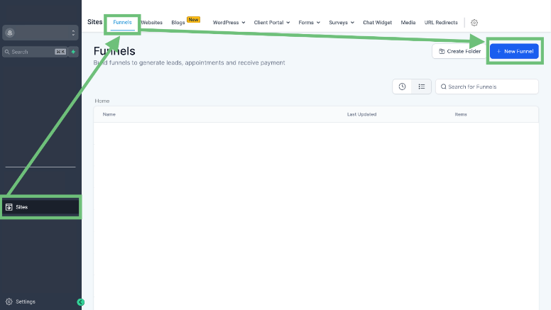
1. To open the funnel builder, navigate to the "Sites" tab in the left sidebar menu. From there, select "Funnels" and click on the "+ New Funnel" button to create a new one. Alternatively, you can choose to modify an existing funnel design by selecting it from the list.
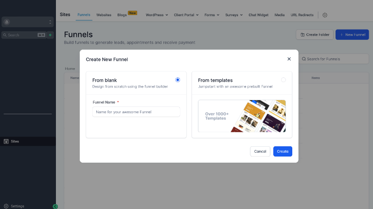
2. Start with a blank page and shape everything from the ground up, or pick a responsive template from the library to kick things off. You can take the reins from there, adjusting the mobile design to suit your needs. Whether you’re after total creative control or a quick head start, it’s all in your hands.
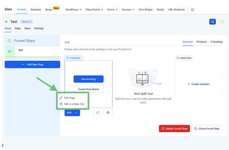
3. To enter the funnel builder, simply click on the "Edit Page" button, and you’ll be ready to make your adjustments. From there, you can tweak every detail of your funnel to match your vision.
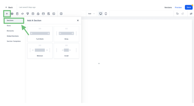
4. Hit the “+” button to add a new section, then pick the column layout that works best for your design. Choose what fits the flow of your content, and get started with building the perfect structure.
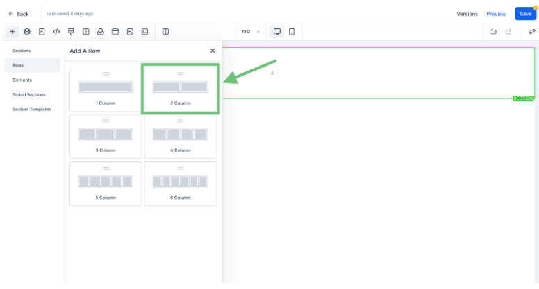
5. Next, insert a row and pick how many columns you want (for instance, two columns). This gives you the flexibility to structure your content exactly how you need it.
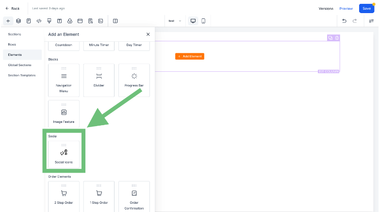
6. From the element list, simply drag the social icons element and drop it into the section where you want it to appear. Adjust it as needed to fit seamlessly with the rest of your layout.
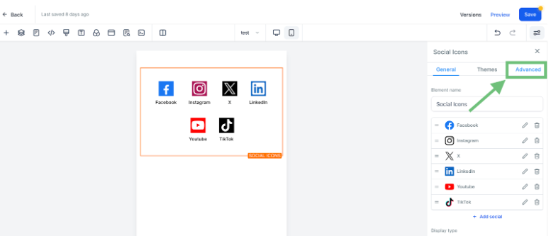
7. Once you’ve added the social icons, click on the element. The settings for that element will appear in the right panel. From there, hit the "Advanced" button to access more detailed customization options.
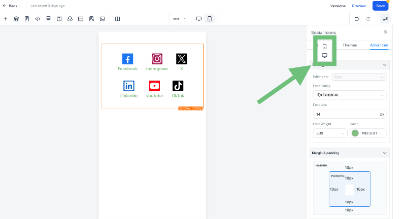
8. You can customize the social icon element in real-time for mobile view. Simply switch to the mobile view and make adjustments such as changing the font style, size, color, and more to suit your preferences.
FAQs
Q. How do I make sure my social icons look good on mobile?
To ensure your social icons are mobile-friendly, switch to the mobile view within the builder. From there, you can adjust their size, color, and positioning to make sure they display perfectly on smaller screens.
Q. Can I customize the icons for both mobile and desktop separately?
Yes, you have full control to customize your social icons separately for mobile and desktop views. You can tweak the settings for each device to ensure the best user experience across all screen sizes.
Q. Will my changes automatically update on both mobile and desktop?
No, changes you make in mobile view won’t affect the desktop layout unless you manually apply similar changes. This allows you to customize each view independently without one interfering with the other.
Q. How can I add new social media platforms to the icons?
You can easily add new social platforms by editing the social icon element. Inside the settings, simply choose the platform you'd like to add, input the relevant link, and it will appear alongside your other icons.
Q. What if the social icons aren’t showing up correctly?
If your icons aren’t displaying correctly, check if they’re properly linked and that no conflicting settings are in place. You can also clear your cache or refresh the page to make sure everything loads correctly.
Q. Can I use custom icons instead of the default ones?
Yes, you can upload custom icons to replace the default ones. Just go into the settings and choose the "upload custom icon" option to use your own designs.
Conclusion
Optimizing social media icons for mobile responsiveness is a small yet crucial step in enhancing user experience and engagement. When visitors can easily find and interact with these icons, they are more likely to connect with your brand across different platforms. With Mobile Responsive Editing, businesses can ensure that icons are properly sized, well-placed, and fully functional on any device. This not only improves website navigation but also strengthens social media presence and drives conversions. Don’t let poor icon placement hinder user engagement—take advantage of mobile-friendly customization to create a seamless and professional online experience. Ready to enjoy this cool tool from a user-friendly platform? Visit Zapiy now!


Youtube
Facebook
Instagram
LinkedIn
TikTok
X
Pinterest